Project overview
The inaugural Photoworks Festival features curated works by eleven visual artists exhibited on billboards around Brighton and Hove. Alongside this there’s a digital festival hub and a ‘Festival in a box’ comprising printed versions of the works.
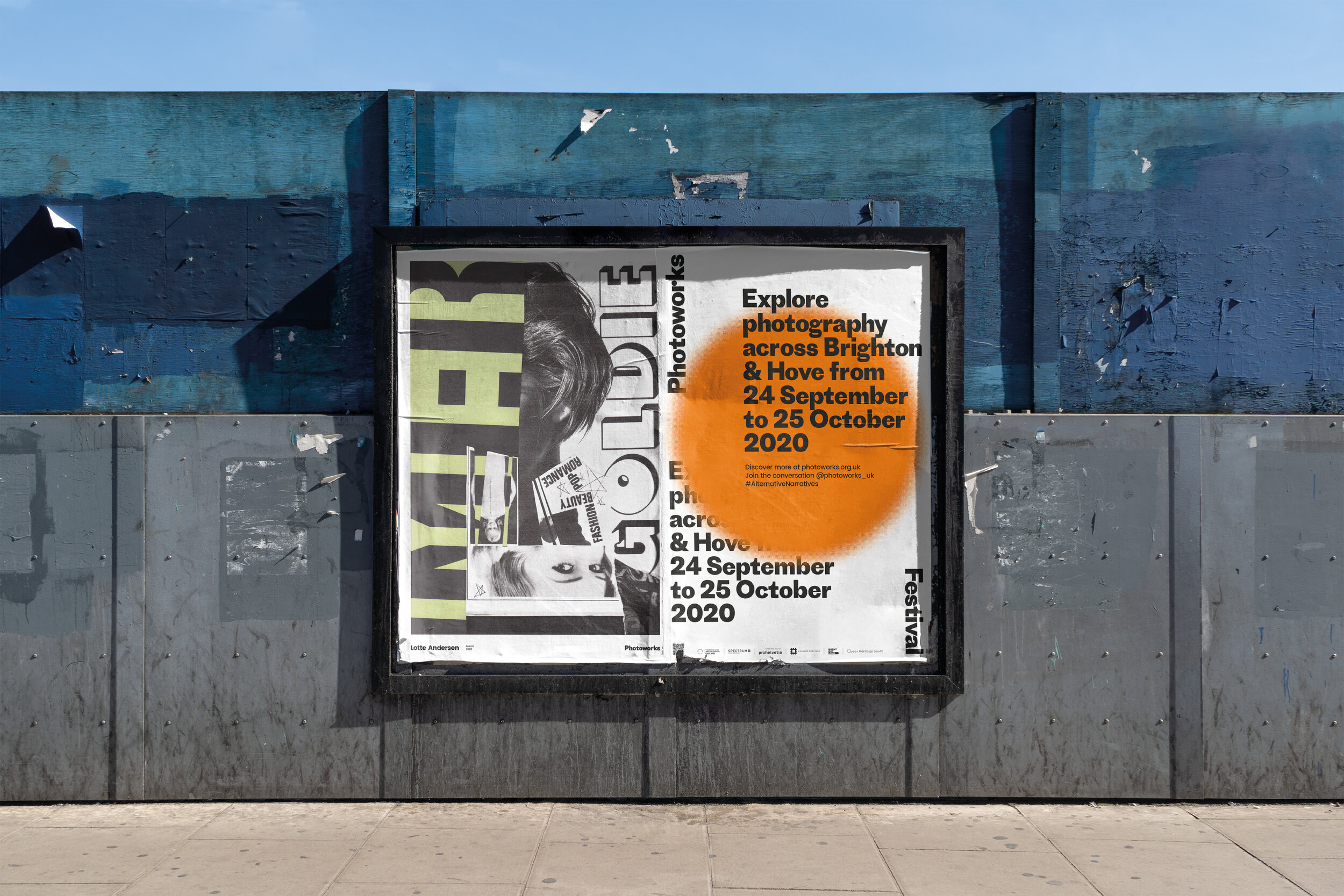
The festival branding builds on the theme of focus and lenses. This was first established back in Spring 2020 with the launch of the new Photoworks identity. The big orange circle acts as a lens highlighting events, dates and artist names. Layering and animating the circle in digital applications is a really simple and effective way to highlight key messages.
What we did
Brand identity
Digital Billboards
Outdoor Posters
Website Design
Social Media Assets
Festival site developed with Tim Jukes