Packaging Design Project
We teamed up with Glasgow-based coffee legends Dear Green for a refresh of their visual identity and brand messaging.
Dear Green has been brewing ethically sourced, sustainable coffee since 2011, earning a solid reputation across Scotland’s thriving coffee scene. Fun fact, our Creative Director, Kerr Vernon, actually designed their original logo when they first launched, so it was a real full-circle moment to revisit the brand more than a decade later.
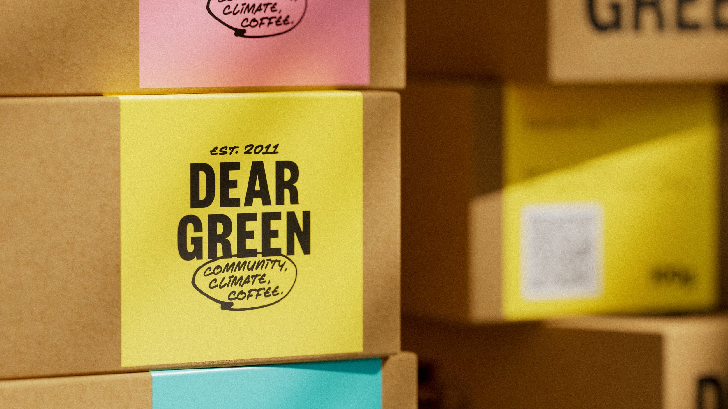
We kicked things off with a brand workshop to dig into their challenges and refine their positioning. From there, we created a clear messaging framework centred around the three Cs: Community, Climate, and Coffee – a simple but powerful way to communicate their values.
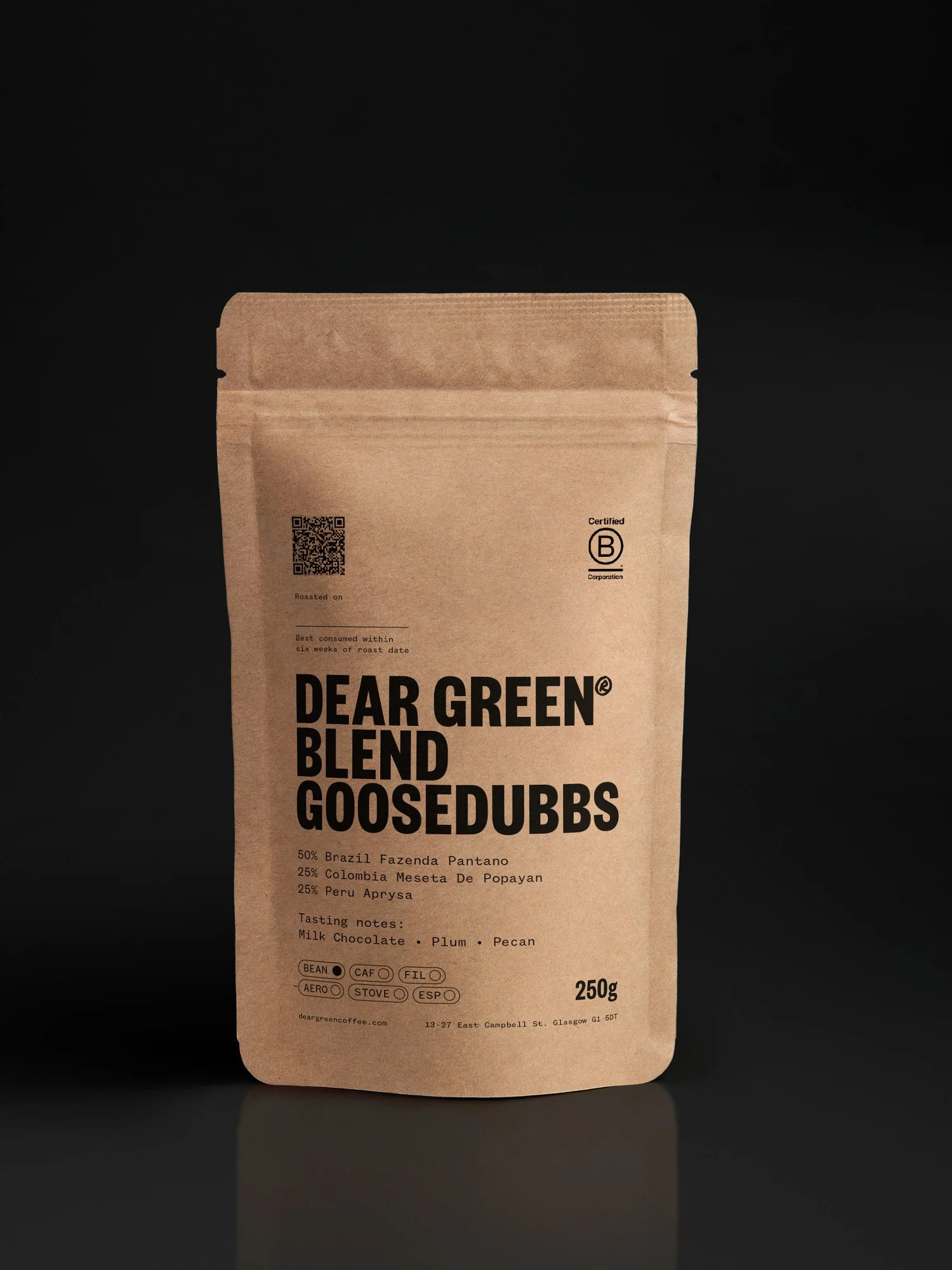
On the design side, we kept the original wordmark to maintain brand recognition, but added a bold, marker-style secondary font to bring more warmth and personality. The refreshed identity feels more expressive, purpose-driven, and ready to roll out across everything from their website to retail packaging.
What we did
Workshop
Brand refresh
Packaging
Merch