Project overview
We partnered with Glasgow-based specialty roasters Dear Green to refresh their visual identity and brand messaging.
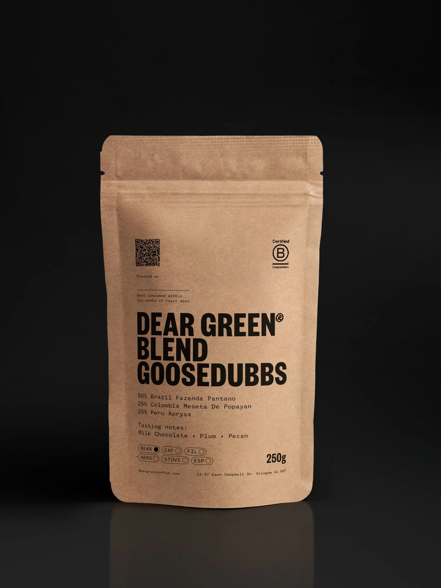
Founded in 2011 and known for ethical sourcing and sustainability, Dear Green has become a key player in Scotland’s coffee scene. Our Creative Director Kerr Vernon designed their original logo when the business first launched, so it was great to return to the brand after more than a decade.
We began with a brand workshop to identify challenges and clarify positioning. From this, we developed a messaging framework built around the three Cs: Community, Climate and Coffee. This helped focus their narrative and values in a clear, memorable way.
Visually, we kept the original wordmark typeface to retain brand equity, and introduced a bold, marker-style secondary font to add warmth and energy across applications. The updated identity is more expressive and better aligned with their purpose.
What we did
Workshop
Brand refresh
Packaging
Merch