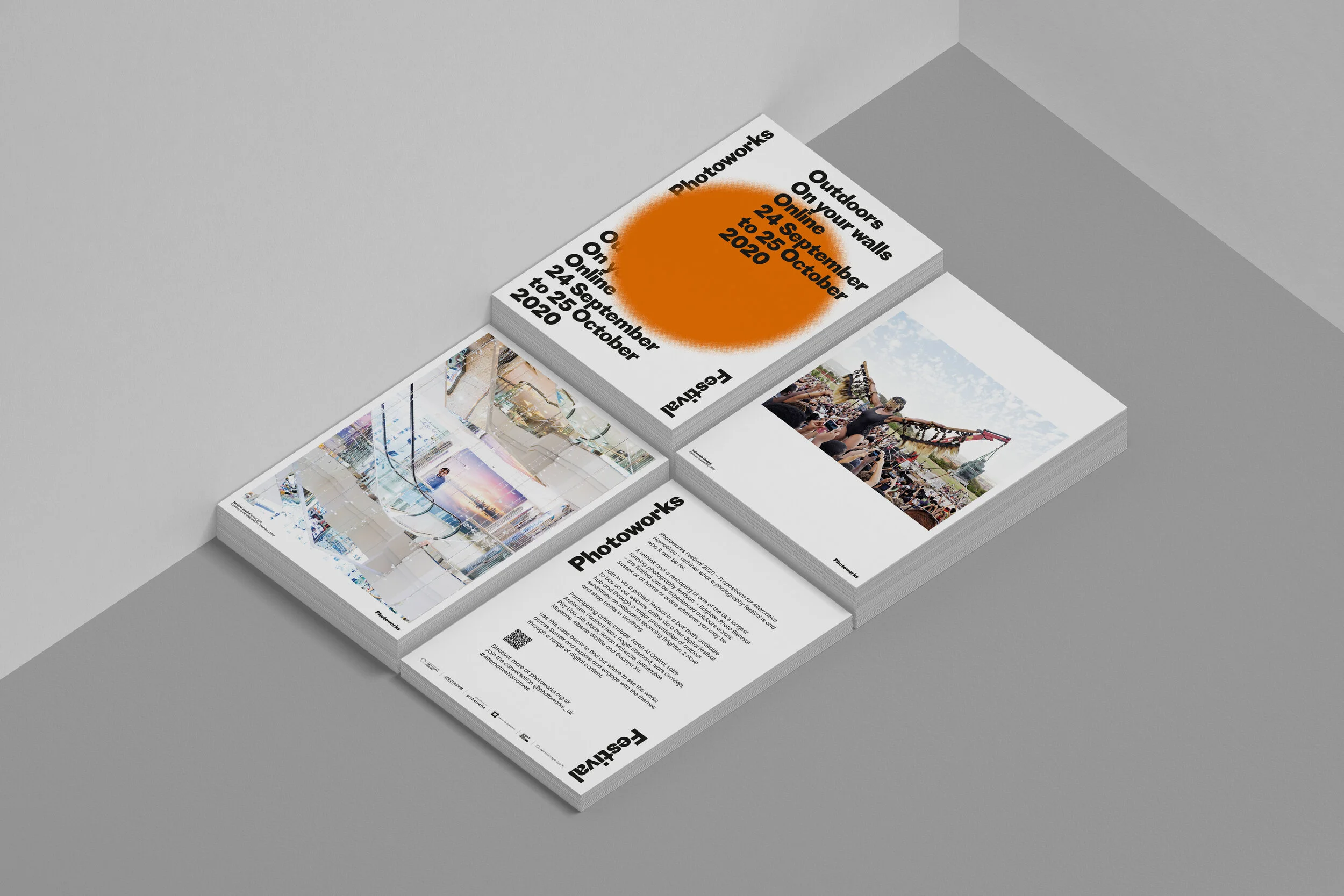
Photoworks Festival Brand Identity
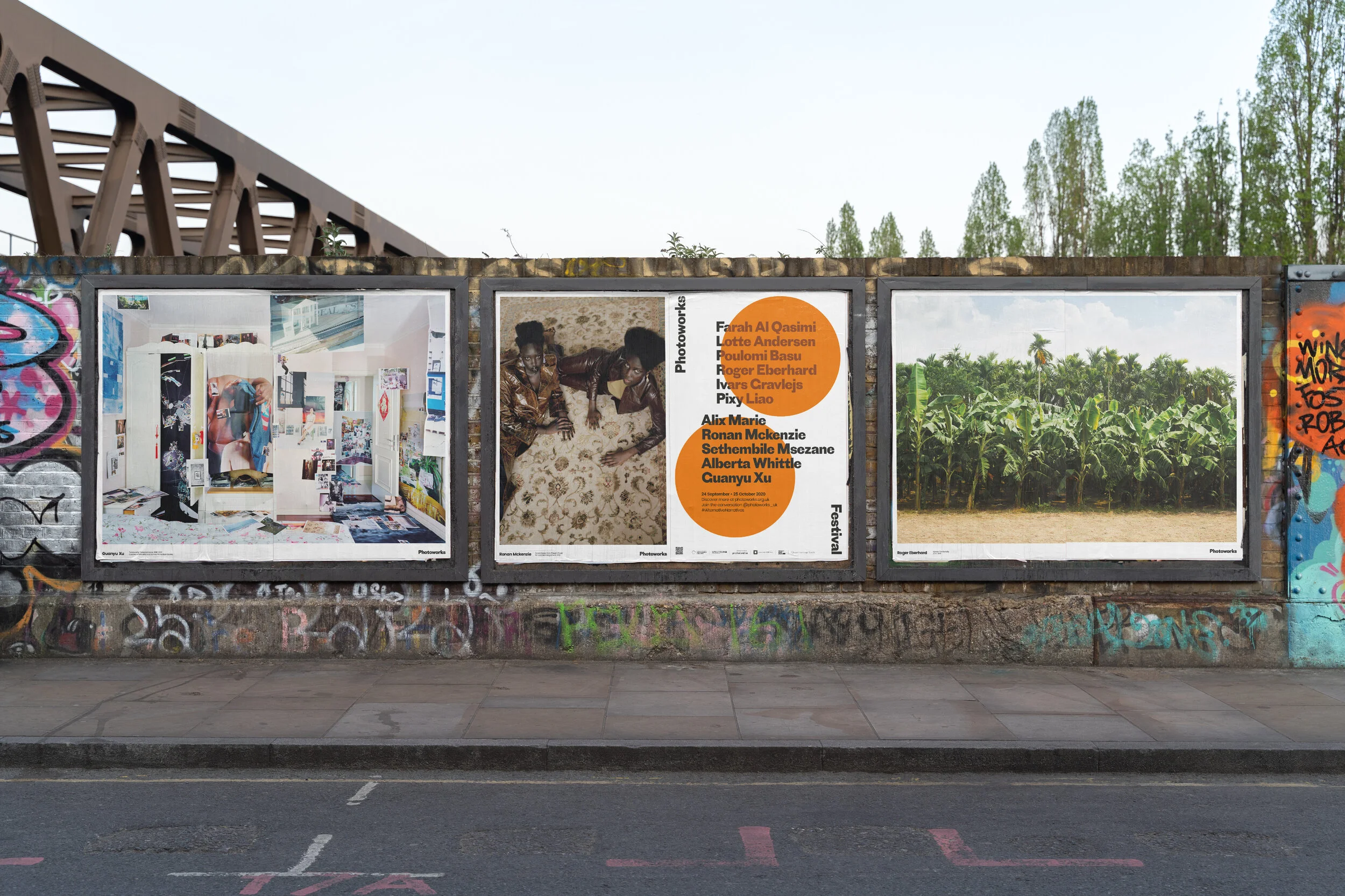
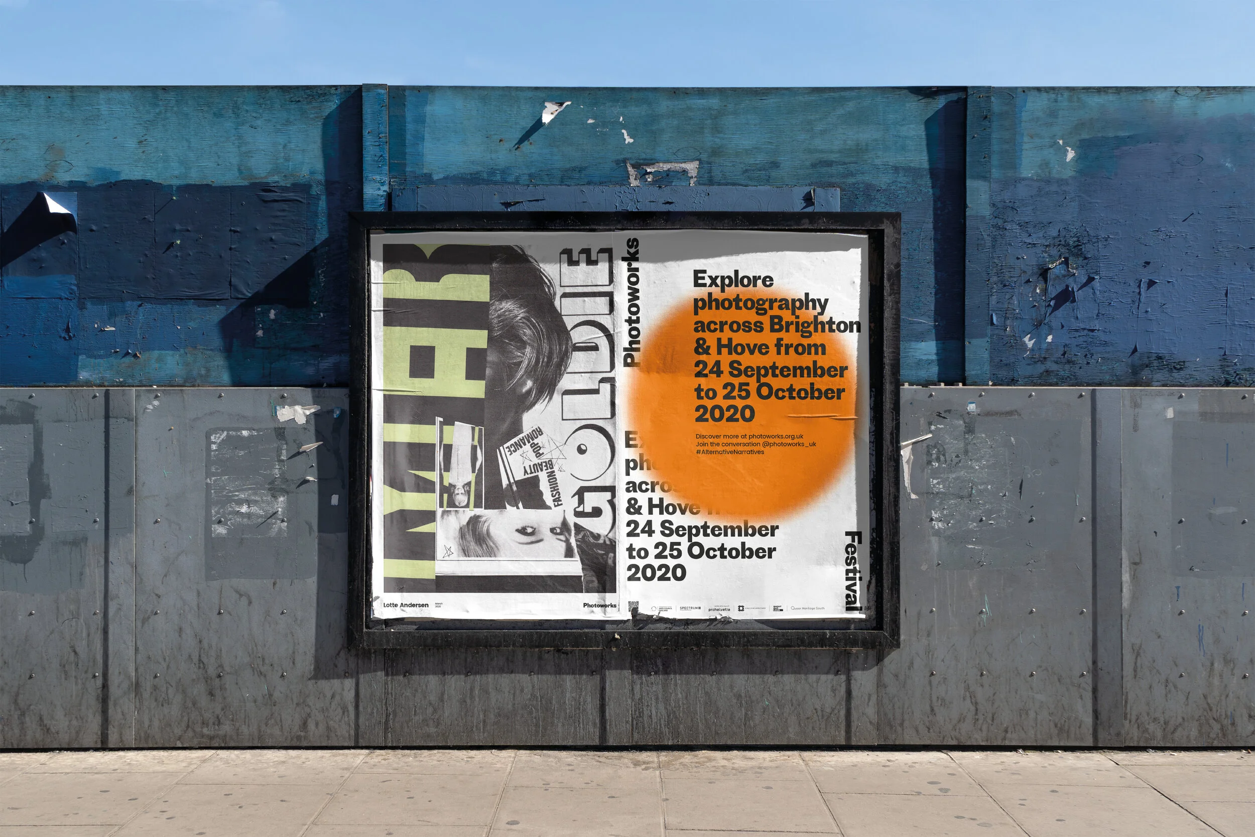
The inaugural Photoworks Festival presented curated work by eleven visual artists, exhibited on billboards across Brighton and Hove. Alongside the outdoor programme, the festival included a digital hub and a ‘Festival in a Box’ featuring printed versions of the artworks.
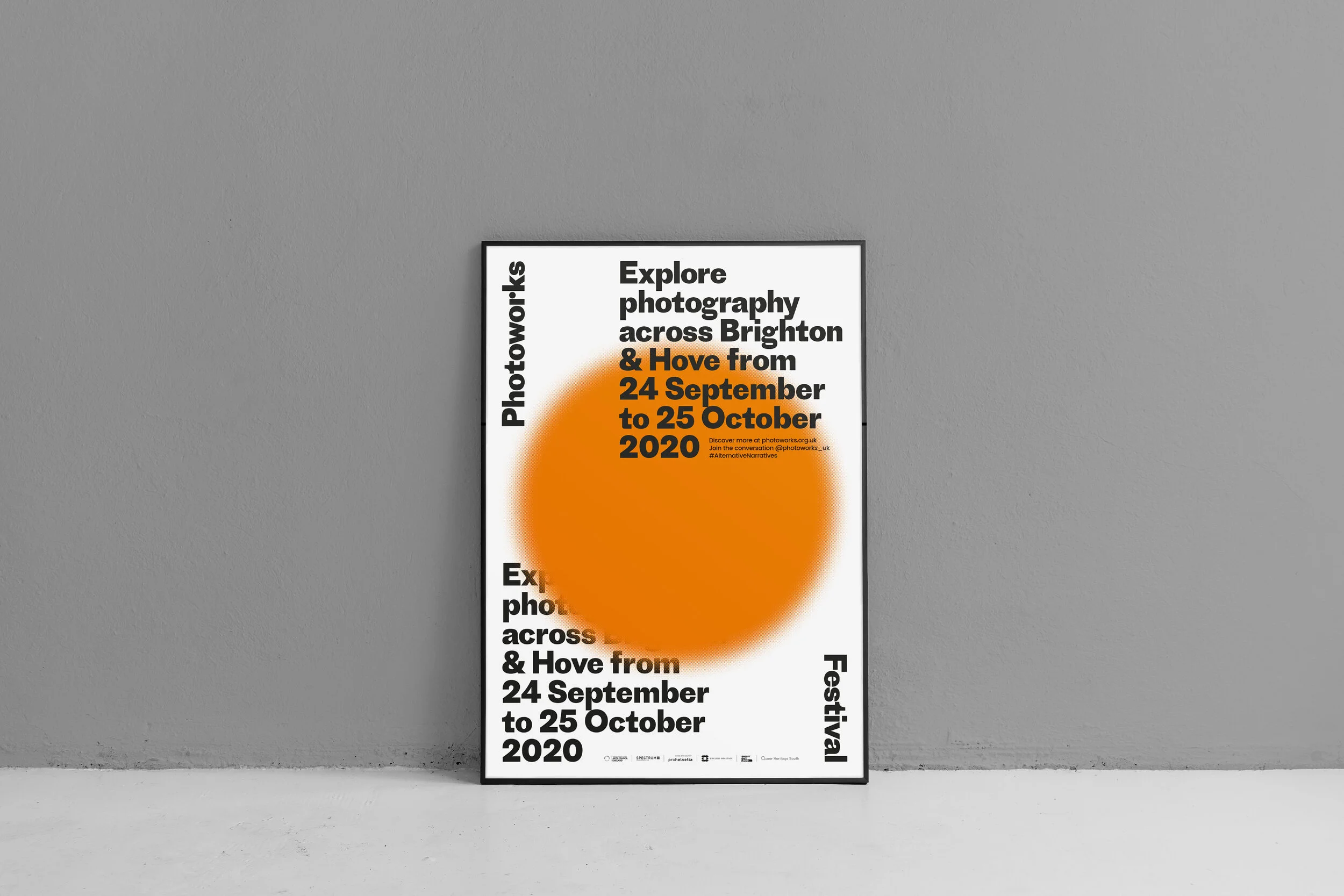
The branding builds on themes of focus and lenses, first introduced with the Photoworks identity launch in 2020. A bold orange circle acts as a visual lens, highlighting dates, events and artist names. Used across print and digital applications, the device provides a simple, flexible way to draw attention to key messages.
WHAT WE DID
· Brand identity
· Digital Billboards
· Outdoor Posters
· Website Design
· Social Media Assets
Festival site developed with Tim Jukes